Below are a few selected images of my previous commercial projects. These feature a variety of mediums and subjects, and I have tried to choose images that are a little more unusual for interest. None of these images are for sale individually, they are just displayed here for those who are interested in my previous work.
| |
Click on a detailed thumbnail image to see the entire image in an enlarged view. |
| |
 |
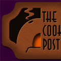
THE COOKING POST
(1998) Internet Logo
I used to do a lot of graphics for corporate websites. This was an internet logo that I created for a small business at Santa Ana Pueblo, New Mexico. |
| |
 |
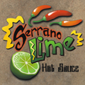
CAJOHN'S SERRANO LIME HOT SAUCE
(2007) Food Lable
This is the base art that I created for a line of hot sauces by CaJohn's Fiery Food's in Columbus, Ohio. |
| |
 |
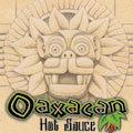
CAJOHN'S OAXACAN HOT SAUCE
(2007) Food Lable
Another example of hot sauce base art that I created for CaJohn's Fiery Food's in Columbus, Ohio. Their sauces are fantastic! |
| |
 |
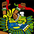
AZTEC CHILEHEAD
(2001) T-Shirt Design
I ran a line of apparel called "Red Hot Tees" for about four years. I started the line for Graphic Connection, a screen printing company in Albuquerque, New Mexico and created many of the designs for it. This one was one of my favorites. |
| |
 |
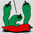
HE'S RED, JIM
(2001) T-Shirt Design
This was another design in the "Red Hot Tees" apparel line, created for the fiery foods industry. It is a play on the Red and Green versions of the New Mexico Chile. In New Mexico, our official state question is "Red or Green?", refering to the color of the chile that is prefered at a meal. One particularly popular variety of the New Mexico Chile is the "Big Jim", adding even more to the pun factor. |
| |
 |
ACOMAZUNI.COM
(1999) Internet Logo
Another example of web graphics from the past with another Southwest theme. What can I tell you? We're in the heart of it. |
| |
 |
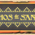
DICHOS DE SANTA FE
(1997) Internet Logo
During my internet graphics period, I explored many ways to create various textures and light at a time when web speed and computer downloads were much slower. The trick was to optimize just about every pixel without losing the asthetics. "Dichos" are little Spanish idioms or sayings. |
| |
 |
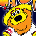
ISOTOPES' ORBIT
(2005) Triple-A Baseball Team Mascot
When the Calgary Cannons (Triple A Baseball team) moved to New Mexico and became the Albuquerque Isotopes in 2003, the team only had one drawing of their mascot "Orbit" that was created before the costume was completed. In 2005 I did a series of renderings of Orbit for the team to use at Isotopes Park, in advertising and on apparel. I designed a lot of the team's fan apparel those first few years as well. |
|
 |
ISOTOPES TAIL DESIGN
(2005) Official Triple-A Baseball Fan Apparel
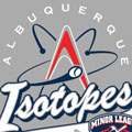
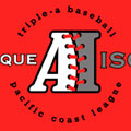
This was one of many apperal designs that I did for the Albuquerque Isotopes. Their fan apperal is still very popular and Triple-A baseball fans are big collectors because the teams have a lot of character. |
| |
 |
ISOTOPES STITCHED-TOGETHER DESIGN
(2005 Season) Official Triple-A Baseball Fan Apparel
Unlike Major League Baseball, Minor League Baseball teams have a little more flexibility to be creative with their apparel design. Because of this, we tried to always have at least one new design for each home game "stand" in those early years, sometimes several. I always tried to create images with a little "design" to them. |
| |
 |
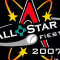
TRIPLE-A ALL-STAR FIESTA LOGO
(2007) Official Triple-A Logo
In 2007, Albuquerque hosted the Triple-A All-star game (we called it a "fiesta"). Each Minor League Baseball team that hosts this event is able to incorporate their "look" into the official logo. Teams have used elements of their stadium, mascot, etc. I decided to use a dramatic version of the Isotopes' regular logo which was already very popular among baseball fans. |
| |
 |
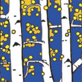
SONLIGHT -ASPENS
(1991) T-Shirt Design
I have designed several shirts for camps and retreats. This is one of my favorites for a camp in Colorado. |
| |
 |
WET YOUR NOODLE
(2004) Ad Campaign Character
I created a series of these pasta characters for a small restaurant chain called Nothing But Noodles. |
| |
|
|

